Rag & Bone
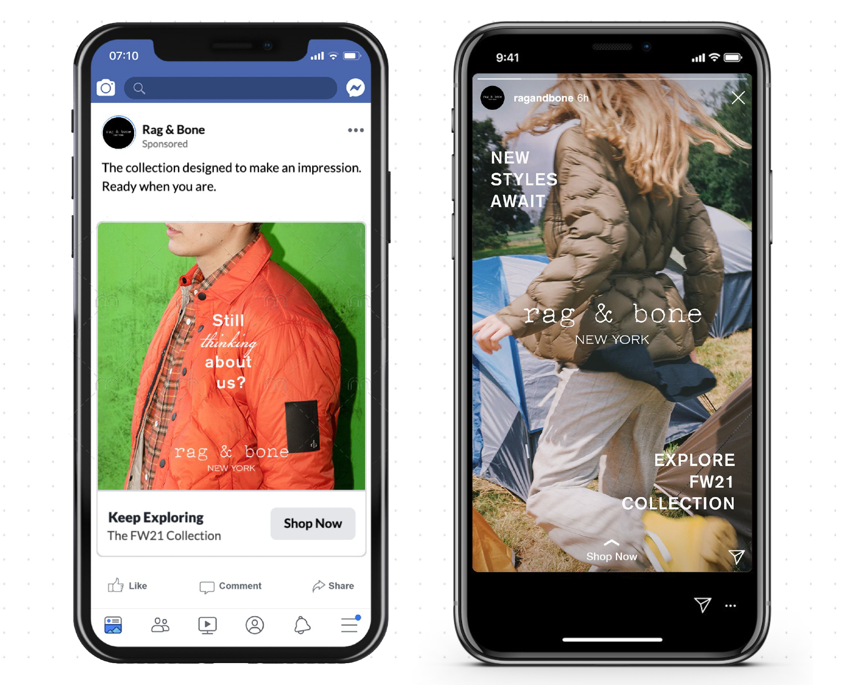
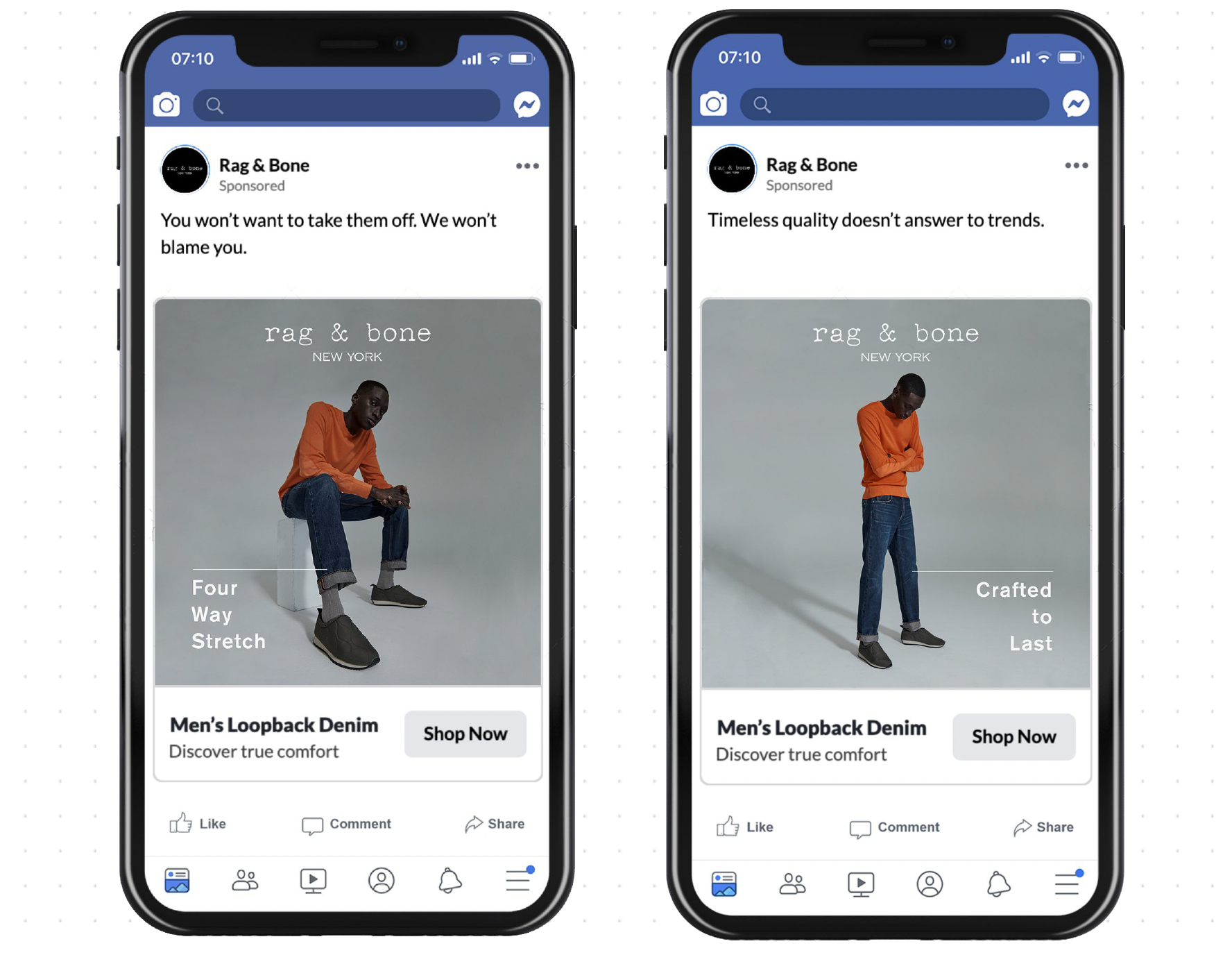
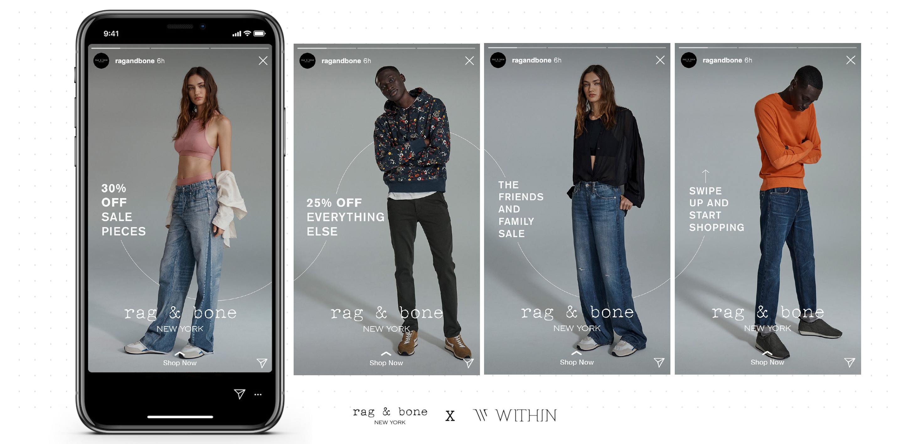
Design for our winning pitch with Rag & Bone — a brand 100% about quality, authenticity, and elegance. We focused on simplicity, clear calls to action, and letting the photography really shine.
/ design
/ layout
/ layout

Positioning & Audience
We identified new opportunities for paid advertising and brand recognition, pitching a more down-to-earth emphasis on photography rather than celebrity, for an audience that can relate more and see themselves wearing Rag & Bone.
For adults, primarily American, who prioritize spending more for quality pieces

Visual Identity
Emphasis on maintaining focus on product and brand, using copy that ties to the adventurous vibe of the brand and layout that remains dynamic and editorial for an elevated feel.
Layout: Keeping type simple, creating depth through thin lines, including logo on each asset.


