

MORI
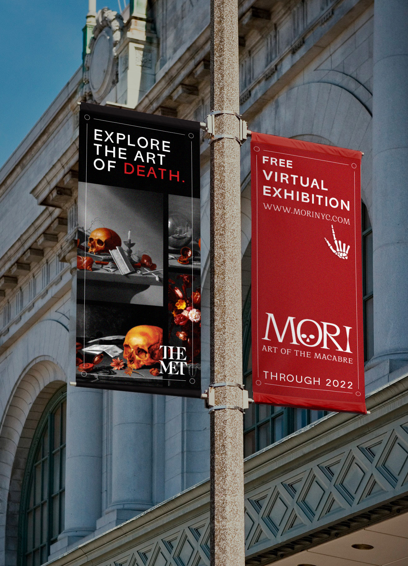
UX/UI AND PUBLICATIONMemento Mori: Remember you must die. European art has been warning us for centuries, and often dedicates entire works to reminding the viewer of the inevitable. MORI is a virtual, interactive exhibition that digs six feet into this concept, taking a look at its symbolism throughout European art history. A 30-page publication was also created.
/ logo
/ user experience design
/ publication design
/ advertising
/ user experience design
/ publication design
/ advertising
Positioning and Audience
The exhibition is sponsored by The Metropolitan Museum of Art in an attempt to connect users with art and art history during the pandemic, which signaled a giant shift in how the world (and world of art) operates. Not only is the exhibit virtual, but it’s free, making it accessible to anyone with a smartphone, tablet, or computer.
The project aims to reach art lovers, students, and museum goers, primarily adults.
We begin through The MET’s website and into the exhibit. There, users can decide which story they’d like to see, with the options of selecting a guided tour or a free-range experience.
Visual Identity
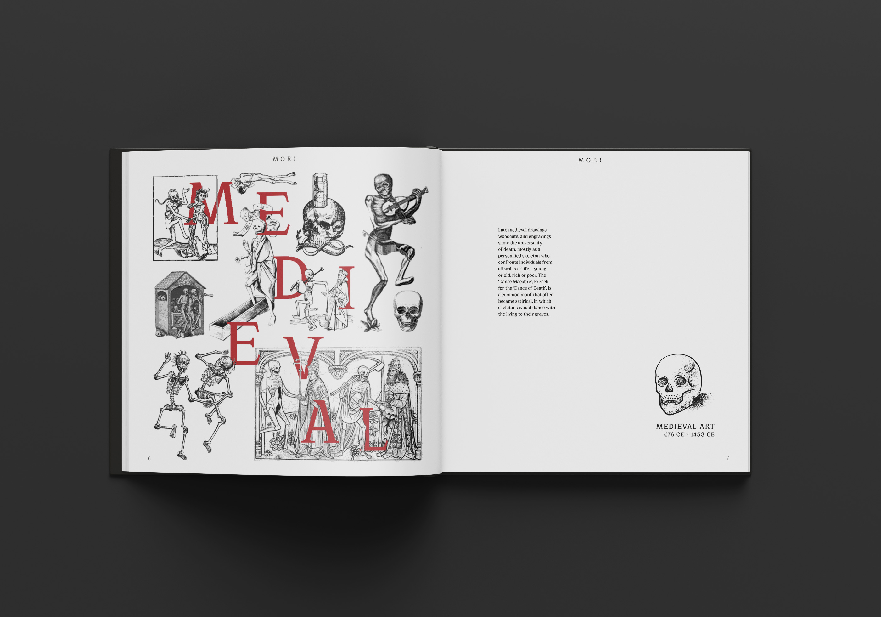
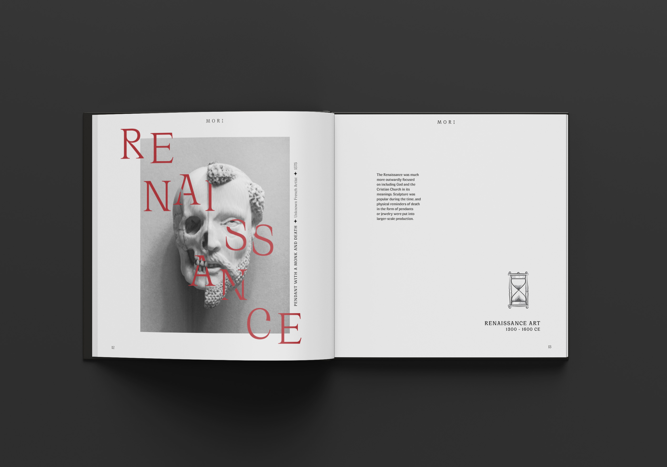
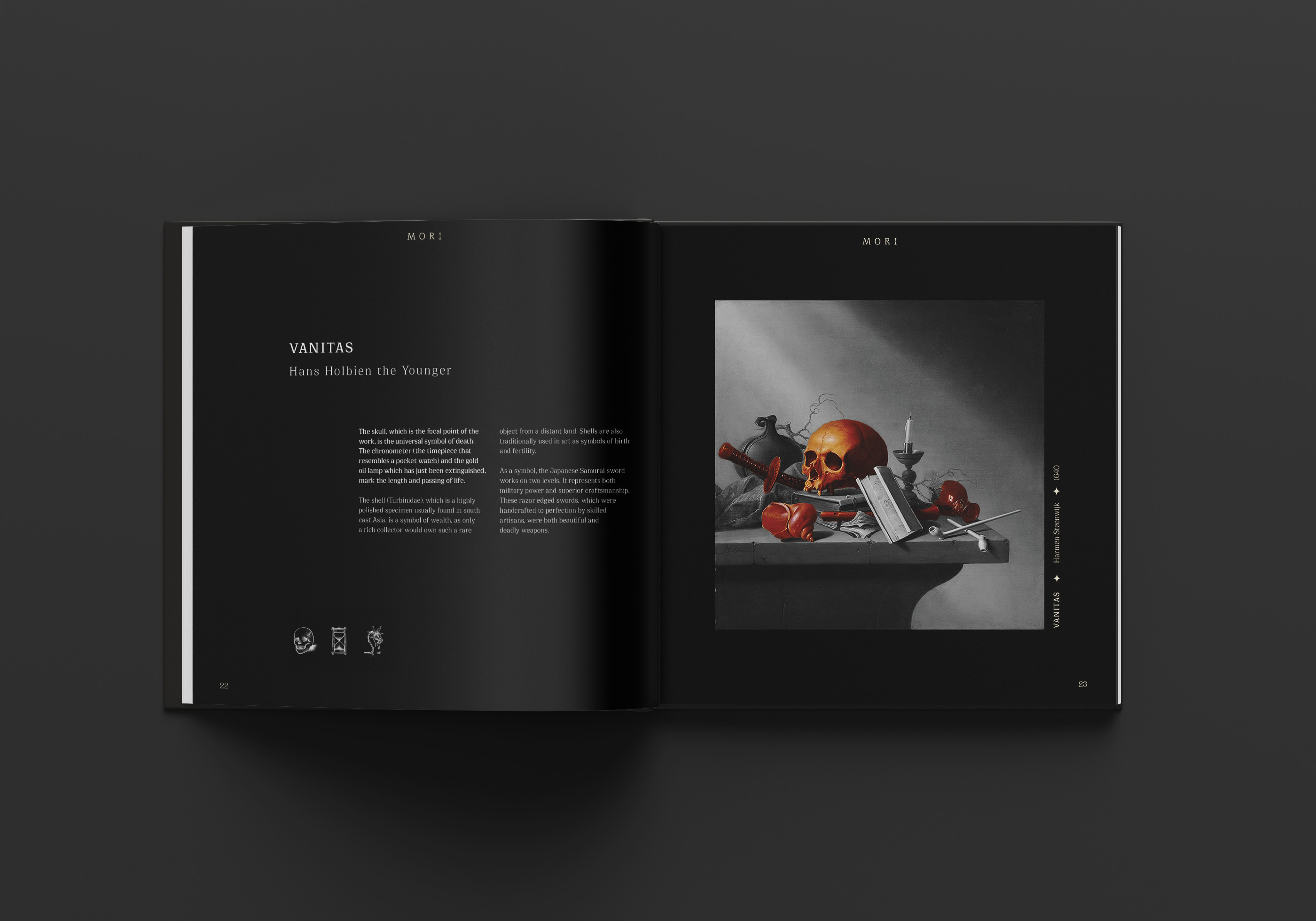
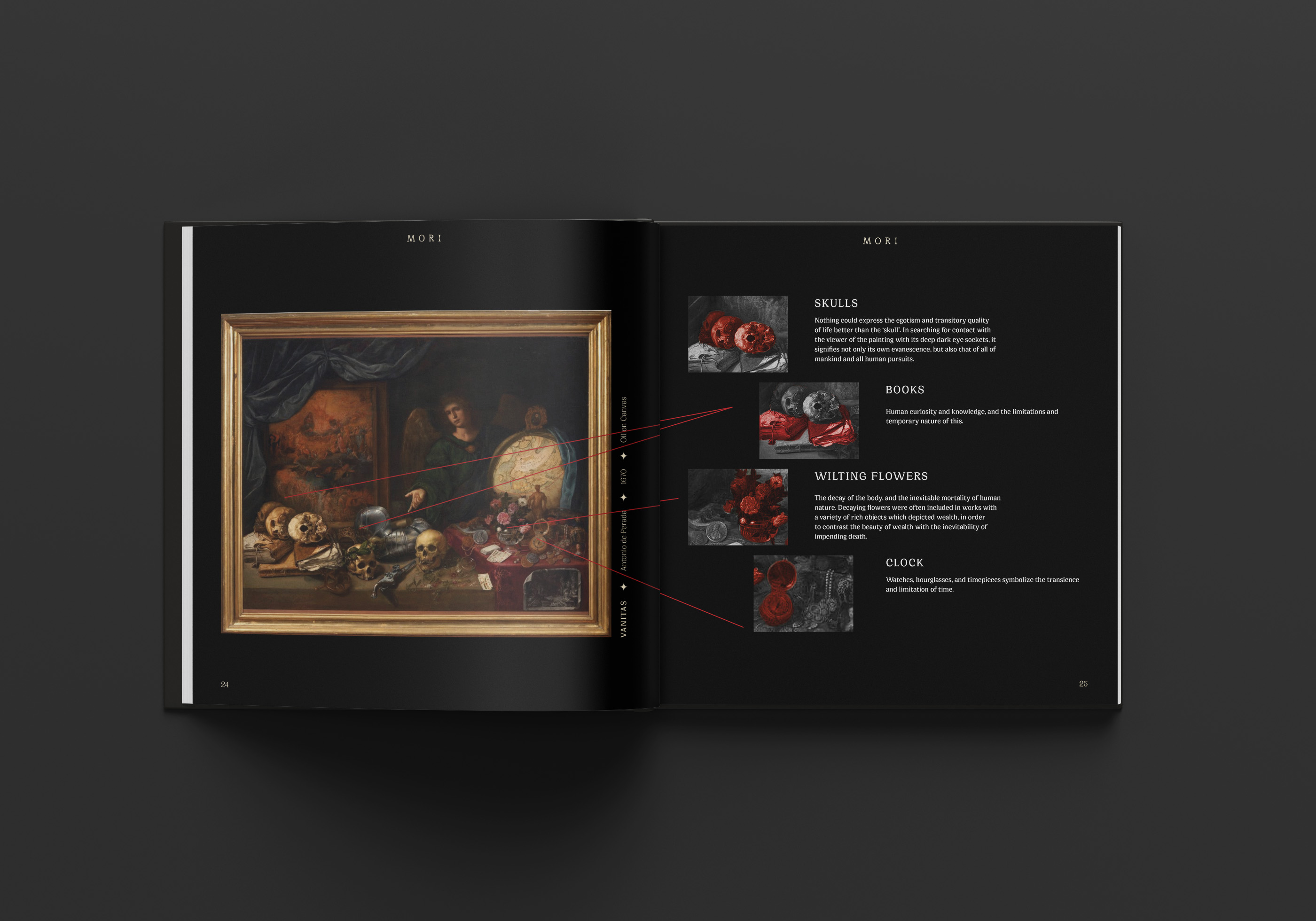
MORI retains the sophistication and elegance of the works it explores. A reduced color palette speaks for this elegance, and the artwork speaks for itself. Balancing these detailed artworks with understated type and minimalist design was crucial. Image treatment includes desaturation and colorizing symbolism, making the information easy to see and understand.
While interacting with the website, users are able to hover for this colorization.
While interacting with the website, users are able to hover for this colorization.
Voice Words
/ dark / poignant / elegant
/ dark / poignant / elegant


Publication
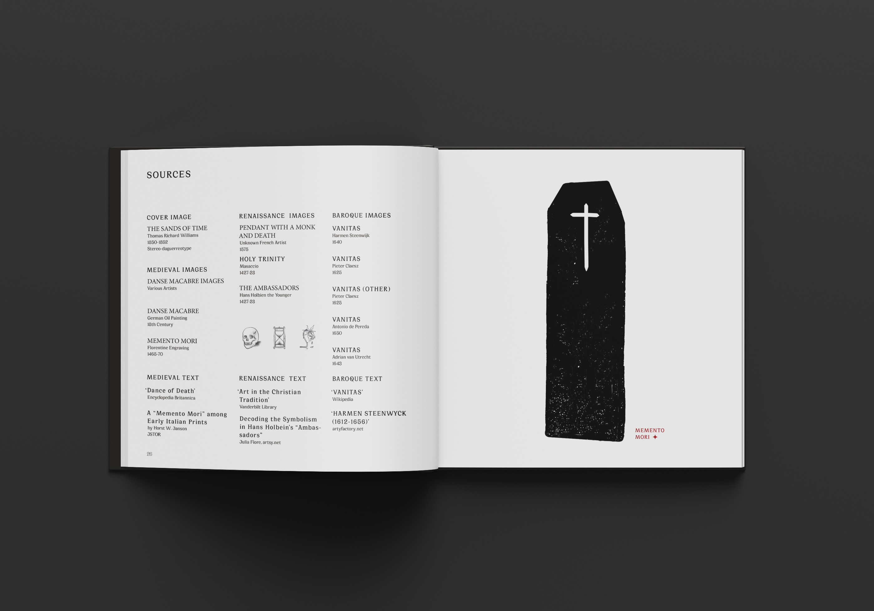
Alongside the exhibition is a 30 page publication created to memorialize the exhibit’s information. The publication is a brief look inside of the particular symbolism of the Medieval, Renaissance and Baroque art periods, featuring selected artworks carrying on the exhibition’s brand. Makes a great collector’s item to any art lover’s bookshelf or coffee table.