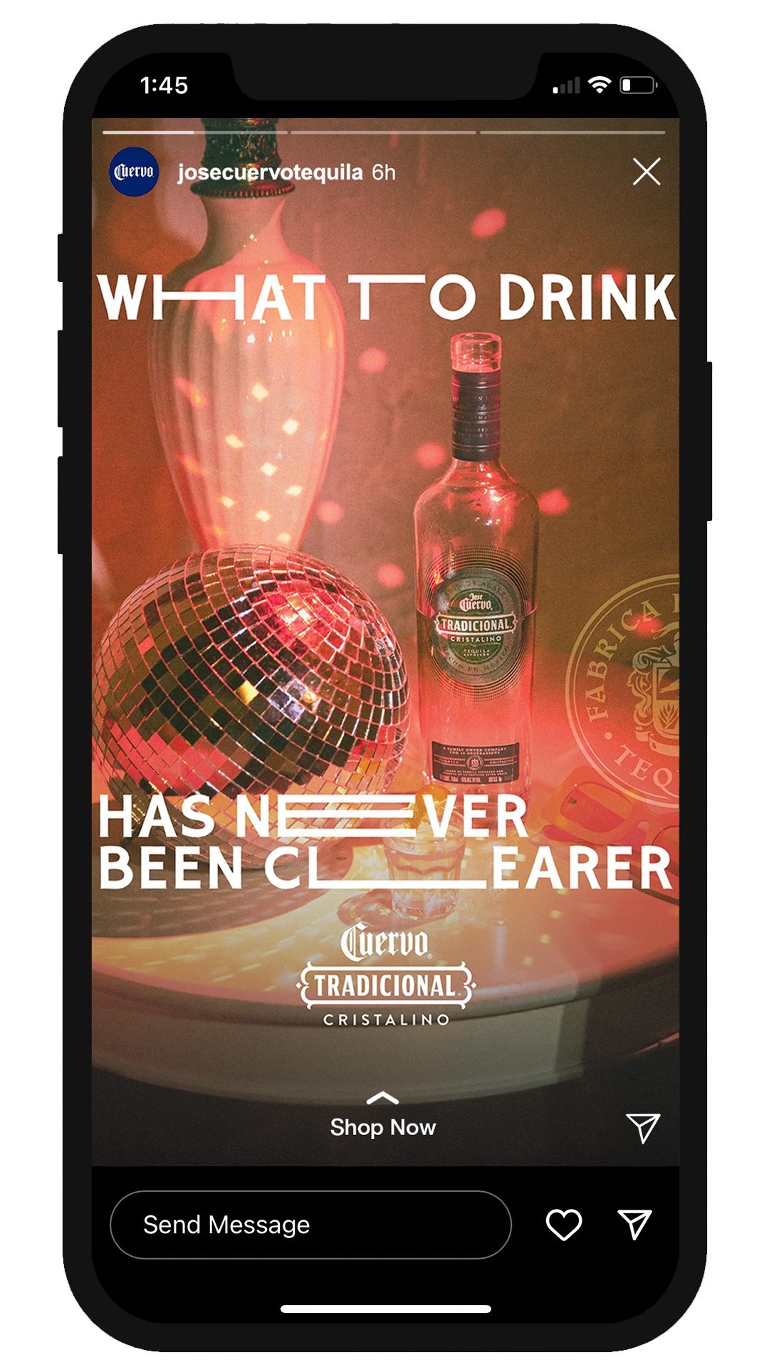
Jose Cuervo Cristalino
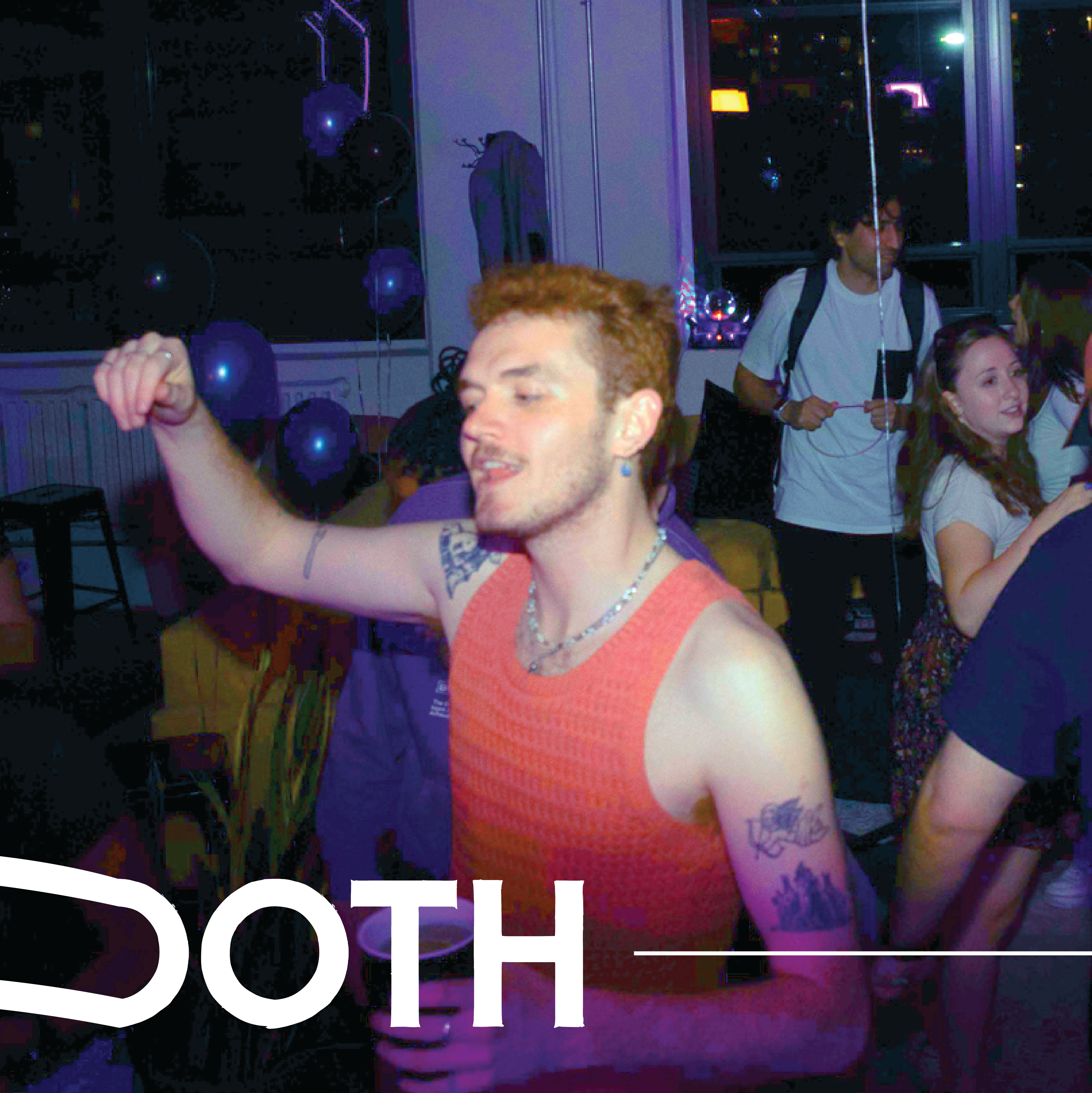
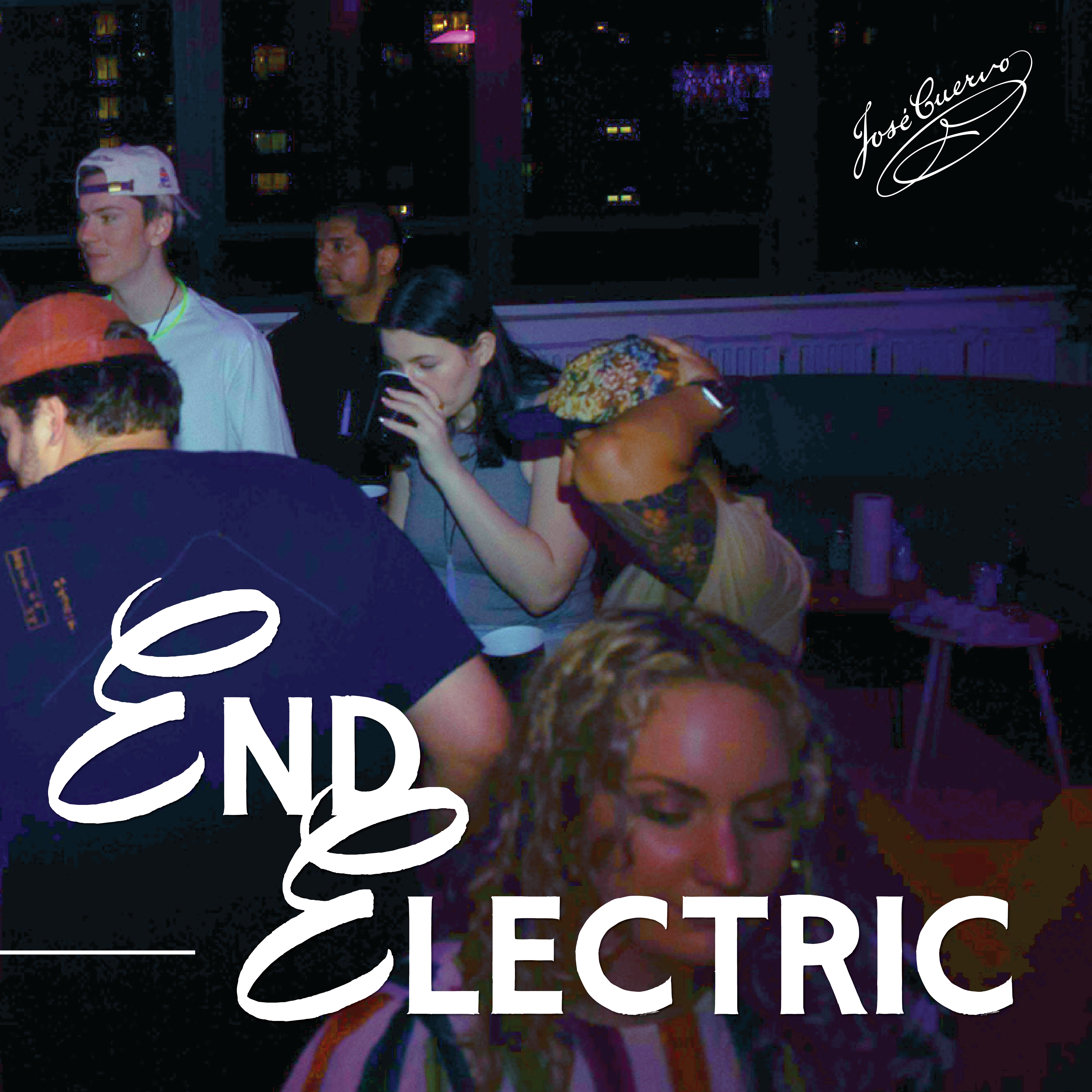
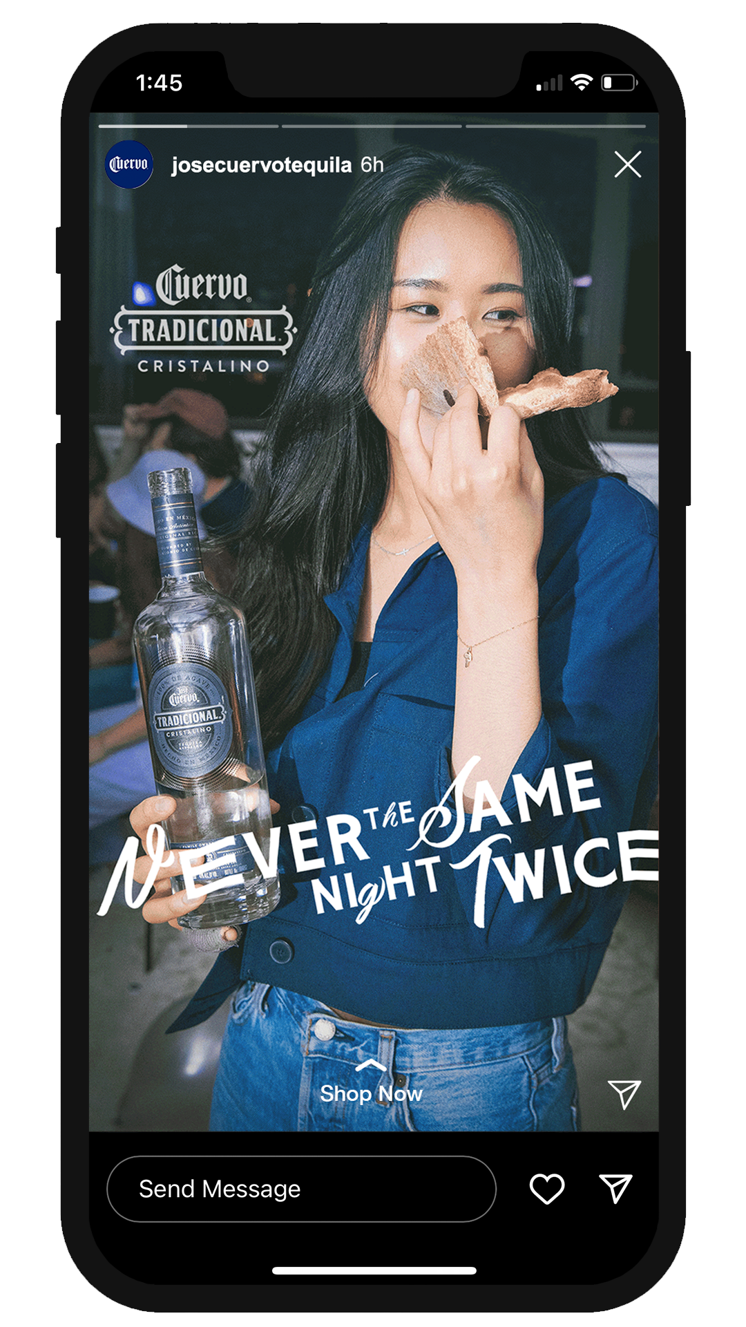
Jose Cuervo wanted to help establish a look and feel for their newest line of tequila: Cristalino. We came up with social, high-energy lifestyle scenes with fun, flowing type to match to demonstrate the unexpected electricity of a Cristalino night — a night set in motion.
/ junior art director
/ designer
/ assist on shoots
/ layout design
/ color grading
/ paid and organic social media ads
/ designer
/ assist on shoots
/ layout design
/ color grading
/ paid and organic social media ads


Positioning & Audience
After more than a year of missed experiences, young spirit drinkers want to get out and make up for lost time — seeking wild and unique experiences that make them feel like the “main character” in their life once again.
For young spirit drinkers: Adults 21-34


Visual Identity
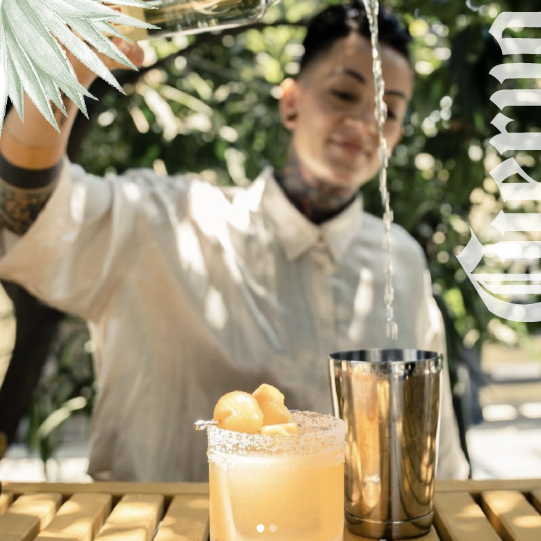
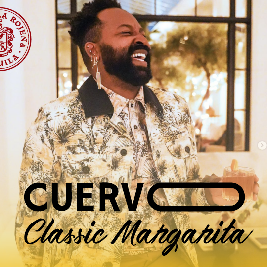
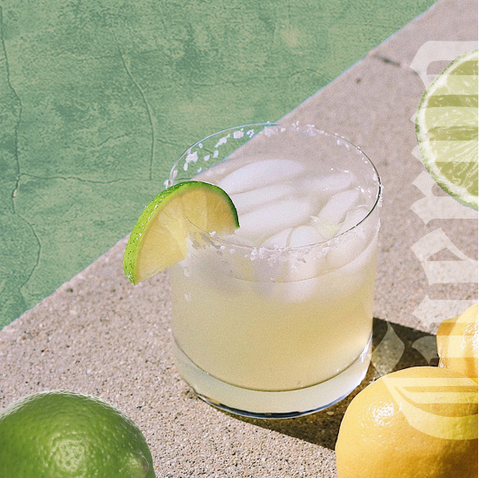
Photography: Showcase uniqueness in style among young partiers, super confident individuals with a mix of casual and formal, use flash photography, group shots within party, have bottle as the highlight of product imagery. Everything else tells the story.
Images edited to make the night look like authentic disposable film photos with texture, subtle vignettes, and color grading.
Images edited to make the night look like authentic disposable film photos with texture, subtle vignettes, and color grading.
Layout: Stretched out, fluid type suggests the smoothness of a night with Cristalino. Use of the Cristalino specific logo and design elements like Cuervo’s seal.


MORE
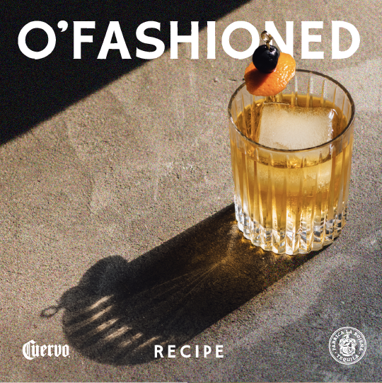
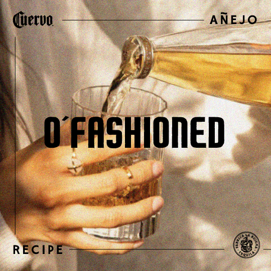
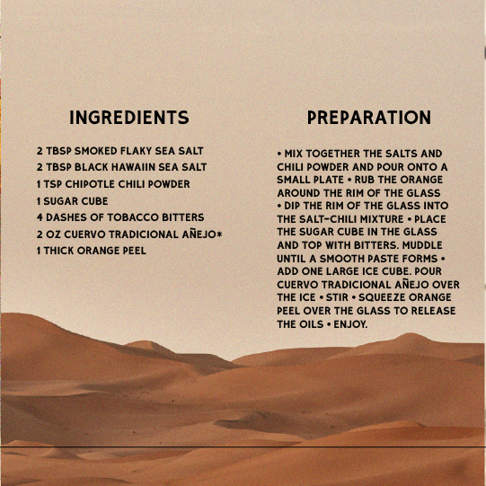
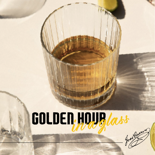
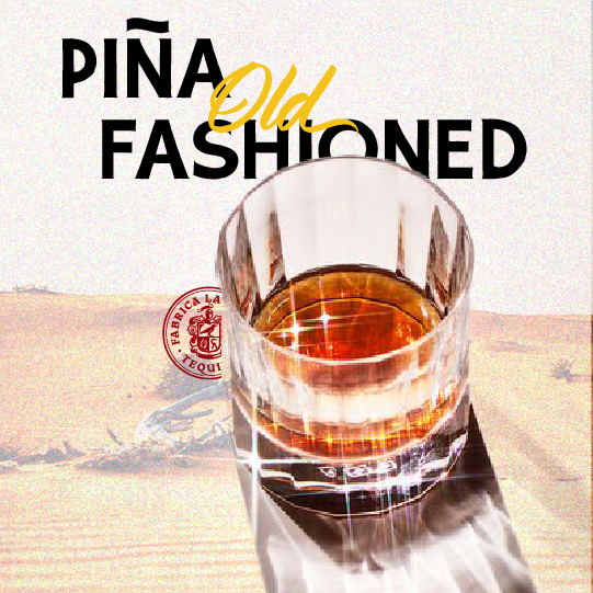
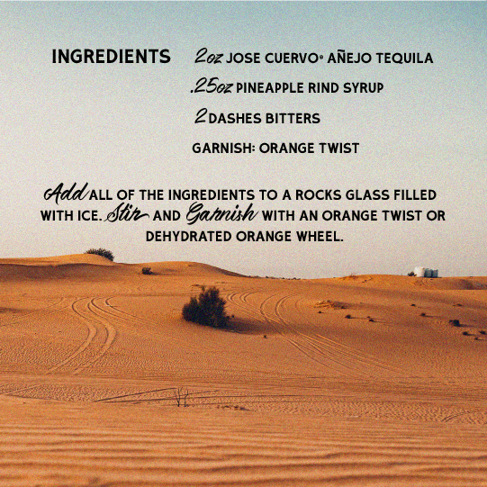
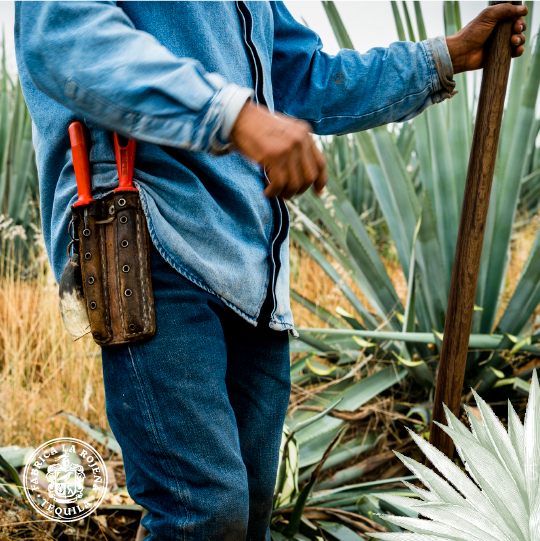
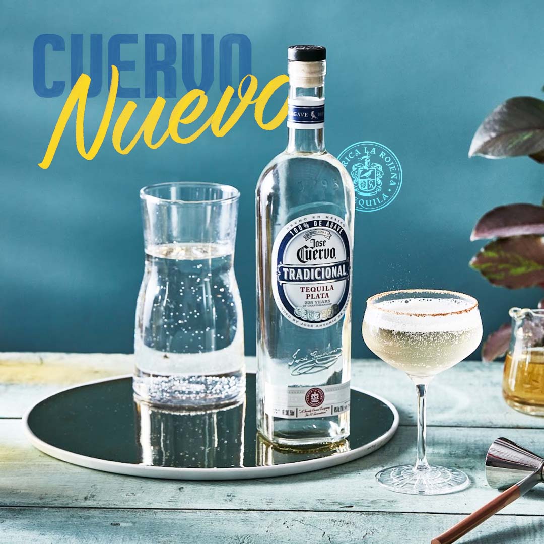
Jose Cuervo Añejo / Plata / Cristalino
Earlier layouts for Cuervo’s more sophisticated and refined tequila, Añejo, and their classic Plata. We took found imagery and combined it with their current brand typefaces, to move forward with specific looks and feels, design and photography-wise.
These are designed in threes, as you would find them on an Instagram grid.
These are designed in threes, as you would find them on an Instagram grid.


MORE
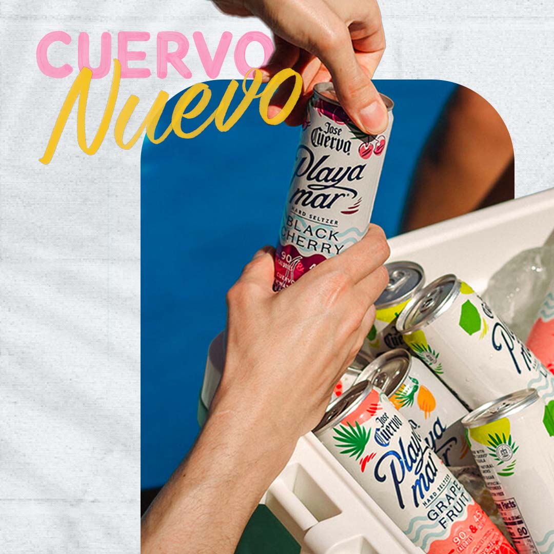
Jose Cuervo Playamar
Single layout explorations for Cuervo’s hard seltzer line, Playamar, using existing brand guidelines to give it a new look.